

Welcome back to another Totally Techniques Design Team blog hop, this month we are highlighting the "torn edge" technique.
These are my projects:


I couldn't decide on which part of the "torn edge" to use. . . but here's a great explanation from Split Coast Stampers which will make it easier for you!
These are the materials I used for the three cards:
Happy Holly-Days stamp set
Christmas Season stamp set Very Versailles stamp set

 I then shifted the torn edge to a different section of the white card, closer to the post it note section and blended Crumb Cake ink from the torn edge stencil towards the post it note border. You can see the darker section. Finally I flipped the torn edge stencil towards the left hand side of the white card and blended Soft Suede ink towards the left edge with a blender brush.
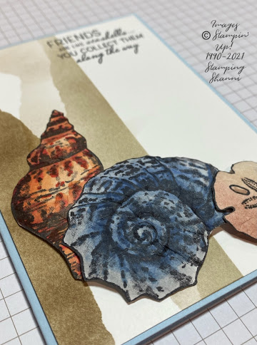 The shells from the Friends Are Like Seashells set were stamped in Tuxedo Black ink on Basic White card and coloured using the following Stampin' Blends -- Light and Dark Pumpkin Pie, Light Poppy Parade, Light and Dark Night of Navy, Light Smokey Slate, Ivory and Bronze.
 I fussy cut the shells out and distressed the card stock on the rear of the images to add some dimension and texture.
 I then adhered them to the card with dimesionals so that they layered and add depth to the layout of te card.
 The sentiment is from the same stamp set and is stamped directly on the card in Tuxedo Black ink. This is a really quick and easy technique to us with dramatic effect.
 The second card uses "torn edges" as a feature of the card. I am not so happy about my colour choice in the card but I wanted to draw out the colours of the bird. There was a lot of fussy cutting on this card. I wanted a vintage feel and thought the Be Dazzling specialty paper would lend itself to the theme.
 Pine cones from the Christmas Season stamp set where stamped in Soft Suede and Early Espresso on Basic White card (a two step stamped image) and fussy cut. The two different foliage images were stamped in Old Olive and Mossy Meadow and the spruce leaves in Mossy Meadow, the spruce leaves were fussy cut but fortunately the larger leaves have a matching die in the Season Labels Dies pack which complement the stamp set.
 The bird is from the Happy Holly-Days stamp set, stamped in Tuxedo Black on White card and coloured with the Stampin' Blends -- Ivory and Bronze, Light and Dark Crumb Cake, Dark Crushed Curry, Light Poppy Parade,Light and Dark Cherry Cobbler. I snipped the beak slightly and inserted apiece of the fussy cut spruce to make it look like the bird was holding the greenery. I coated the bird in Shimmery Crystal effects to help it stand out from the leaves and Be Dazzling paper which was also cut with the Dies from the matching set.
 I stamped the birch trees from the Welcoming Woods stamp set in Early Espresso on the Crushed Curry card after I had torn the yellow and Real Red card edges to match so that the red would frame the yellow background.
 The sentiment is stamped directly on the Mossy Meadow card in Tuxedo Black. The greeting comes from the Happy Holly-Days set as well.
 Card 3 uses both pieces of the "torn edge" to create a channel on the Basic White card for an interesting feature. I blended the Soft Sea Foam ink with a blender brush between the torn edges, then stamped the script from Very Versaille in Crumb Cake and the foliage from the same set in Mossy Meadow whilst the stencils were in situ so the stamped images only appear in the channel of colour.
 The "fly poo" stamp from the Forever Fern stamp set is stamped in Early Espresso to create interest below the bird image.
 The sentiment is from the Happy Holly-Days set stamped in Tuxedo Black on Basic White card and cut out using the shape from the Seasonal Labels die set, which I shortened by rubbing it through the die a second time.
 I coloured the bird with the same colours as detailed for the Mossy Meadow card above. I fussy cut the bird and adhered it directly to the white card. The card base is Real Red and lined inside with a rectangle of Basic White.
Welcoming Woods stamp set
Friends are Like Seashells stamp set
Forever Fern stamp set
Seasonal Labels Dies
Friends are Like Seashells stamp set
Forever Fern stamp set
Seasonal Labels Dies
Basic White card stock
Mossy Meadow card stock
Real Red card stock
Crushed Curry card stock
Balmy Blue card stock
SAB Be Dazzling Specialty Paper
Tuxedo Black Memento Ink
Mossy Meadow Classic Stampin' Ink
Old Olive Classic Stampin' Ink
Early Espresso Classic Stampin' Ink
Soft Suede Classic Stampin' Ink
Crumb Cake Classic' Stampin' Ink
Sahara Sand Classic Stampin' Ink
Stampin' Blends
Shimmery Crystal Effects
Blending Brushes

For the first card featuring seashells, I used the torn edge to form a stencil to do the three different shaded features on the right hand side of the card. I marked off a section of the Basic White card mount with post it notes and then held the stencil against the white card roughly in the centre -- I shaded from the torn edge back towards the post it notes in Sahara Sand using a blender brush.


I hope you have found some inspiration in today's cards. Take the tie to check out the other members of our Design Team -- they have done an exceptional job!
Until next time, thanks for stopping by,
Cheers
Shanni xx


