Wednesday, December 17, 2014

New Occasions Mini & Butterfly Basics

Every page of the new Occasions Mini which goes on sale on 5 January has something unique and beautiful. I am in love with all of the new stamp sets and have a feeling that this mini catalogue is going to be extremely popular.

My favourite set so far (we can't count our chickens) is Butterfly Basics which of course co-ordinates with the Butterflies Thinlit Dies (remember when you purchase as a bundle you save 15%).

This is my creation this week for a friend's birthday:
Base card is Blushing Bride, mounted with Sahara Sand and then Whisper White which I have stamped on using Sahara Sand and Crumb Cake ink to marry in with the divine and luscious Sahara Sand Lace Trim. . . love the typewriter set letters (Kinda Eclectic) and the netting from Butterfly Basics. The postage franking stamp is from the new set, stamped in Early Espresso.

The leaves are from the Butterfly Basics and Kind Eclectic stamp sets, stamped in Pear Pizzazz and Old Olive respectively.

I have faux stitched the top right hand corner(by piercing the card) and drawn between the pierced dots with a Sahara Sand Stampin' Write Marker. The sentiment from the Butterfly Basics set is stamped in Early Espresso - I have to say that all of the sentiments in this set are perfect.

I always need a bit of bling so this takes the form of Dazzling Diamonds Glimmer Paper cut with the Apothecary Accents Framelit die which I removed the centre from, using an Oval Framelit Die.

The butterflies are cut using the medium Butterflies Framelit die in Blushing Bride, Sahara Sand and Fancy Foil Designer Vellum in Silver. I have layered these up with glue dots and decorated the spines with Basic Pearl Jewels.

Can't wait for the mini to go live!

Sunday, December 7, 2014

Blendabilities and Ornamental Pine

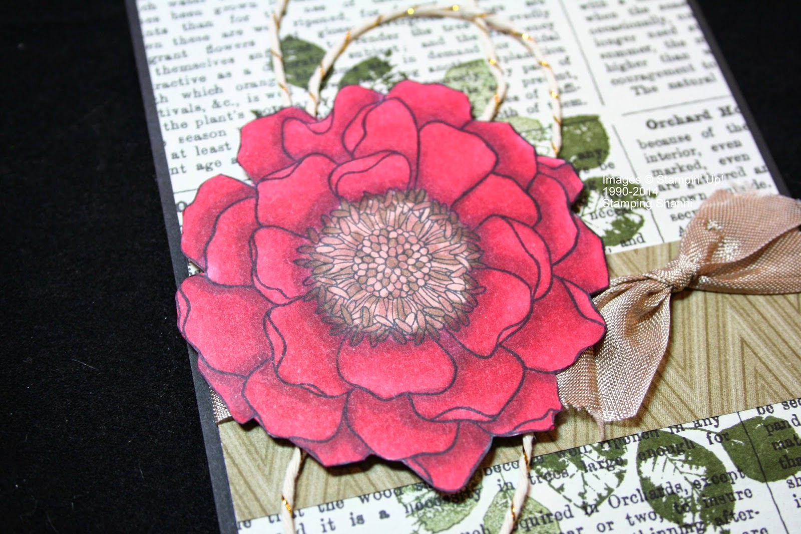
I have wanted to use a more versatile approach to Blendabilities and I think that I am getting a bit better!

Today I have tried to incorporate Blendabilities and the images from Ornamental Pine. Once again I have made two of each design ~ one a little more dressed up and the other a little plainer. . .

Here are today's shares:
For the first cards I stamped the leaves in Mossy Meadow on Whisper White card stock. The pine cones are stamped in Early Espresso on Crumb Cake card stock and I have highlighted areas with the White Gel Pen and fussy cut them and dimensionalised them on the leafy area.

Prior to adding the pine cones I coloured the background from the top right corner with Blendabilities. I faded from the medium Night of Navy colour through the Coastal Cabana tones - dark, medium and light. The blending isn't as smooth as I hoped but I was not unhappy with the overall effect.

I then stamped the background with the "fly poo spots" from the Gorgeous grunge set in Classic White Craft Ink. I wanted the suggestion of snow without too much ink.

The sentiment from the Ornamental Pine set is stamped in Island Indigo which I also mounted at the back of each card.  I added the sequins from the Frosted Sequins embellishment pack in the Holiday Mini Catalogue for a bit of bling and glamour.
Base card for the second creation is Garden Green, mounted with a piece of diamond Garden Green DSP from the Trim the Tree DSP Stack (daubed around the edges with Early Espresso ink).  The corners were rounded with the Project Life Corner Rounder Punch.

I heat embossed the pine leaves and cone in white embossing powder (the pine cone on a separate piece and fussy cut out). I then coloured the leaves with the Old Olive Blendabilities pens starting with the darkest and moving to the lightest overlapping all the time. I coloured the leaf stem in Mocha from the Skin Tone Blendabilities set.  The pine cone is coloured in with the darkest Crumb Cake Blendability pen and attached to the card with a glue dot.

The sentiment was stamped in Craft White Classic Ink on Garden Green and hand cut. I added the Linen Twine for texture and interest.
This card is very similar but with a different piece of DSP from the Trim the Tree DSP Stack - more Garden Green and less contrast. I changed the direction of the leaf stamp and added additional colour to the pine cone by using the Mocha and Bronze Blendabilities from the Skin Tone Set.  The sentiment was stamped on a piece of Very Vanilla card stock so that it contrasts more significantly.
The Ornamental Pine set isn't just for Christmas. Here I have used it in conjunction with my all time favourite set - Lovely as a Tree. I stamped the Lovely as a Tree horizon trees stamp in Memento Tuxedo Black ink, punched out a sun using the 1" Circle Punch and post-t notes.

I then coloured the sunset with Blendabilities from the Night of Navy, Rich Razzleberry and Pumpkin Pie Ranges. I simply blended these across the images. The post-it note masked the setting sun area (that's how I kept it white). The landscape was coloured with the Old Olive Blendabilities set.

To suggest looking at the sunset from trees in the forefront I stamped the leaf from the Ornamental Pine set across the top left hand corner. I married up the stamped image on the coloured card and the background using a Stampa-ma-jig.

The base card is Night of Navy mounted with Whisper White. I mounted the coloured, stamped image on Old Olive card stock and for the top card I actually mounted the whole card on a piece of Old Olive card stock for added weight and framing.

Enjoy!
Shanni

Saturday, December 6, 2014

Trim the Tree DSP Stack & Ornamental Pine

Once I started stamping with this set I found that I was overflowing with ideas on how it could be used. Because Christmas is celebrated in Australia in the height of summer it is hard to make cards that have a Christmas appeal that seems to be associated with snow, red bows and hot apple cider. . . we are all about swimming, barbecues and cold prawn salad on Christmas day.  The Ornamental Pine set offers a bit of Chrissy versatility though and I was excited with the earthy tones that we could employ. . .

Again I have made two of each design to dress one up and to leave the other simpler. There are things that you need to consider with cards ~ postage weight and the ability to send the card without it being damaged. . . so I have tried to be thoughtful about these things when coming up with designs and layouts.

Here are today's shares:
The Trim the Tree DSP Stack is awesome. It has all of the usual Christmas colours like Cherry Cobbler, Garden Green and Early Espresso but there are additional colours like Sahara Sand, Crisp Cantaloupe and Pistachio Pudding for a touch of spice!

Base card in this instance is Whisper White. I have stamped the leaves in Garden Green and the pine cones in Early Espresso on Whisper White card stock which I then cut out quite closely. I have tried stamping the pine cones direct on the card but I really like the effect of the raised pine cones the best. I have dimensionalised them slightly for added effect.

The Real Red pennant behind both mounted images is hand cut and I matched this with the Real Red Satin Woven Ribbon from them Holiday Mini Catalogue. Do you see how trimming your ribbons slightly differently gives a different impact.

The card on the left was mounted on a piece of Real Red card stock whilst the one on the right is mounted on Early Espresso.
Using pieces of the Cherry Cobbler tartan from the Trim the Tree DSP Stack as my base I wanted this card to be classic in colour and layout. You will see that I have mounted the background pieces on the right hand side with more Cherry Cobbler card stock, including the stamped image.

The leaves are stamped in Garden Green. The ornament was stamped in Cherry Cobbler and then fussy cut. I proceeded to gloss the ornaments with Crystal Effects for a shiny effect.

On the left hand card I mounted the sentiment on a white pennant shape that I simply cut around the words and then mounted on a piece of the Cherry Cobbler Linen Ribbon.

For a touch of bling I glittered the leaves on the right hand card using Dazzling Detail.

A little more earthy and Aussie than snow cards but stay tuned as I don't want to disappoint my northern hemisphere fans.

See you soon
Shanni

Friday, December 5, 2014

Ornamental Pine Challenges. . .

I have been absent for a little while because I have been so busy demonstrating, doing classes and holding retreats. . . it has been a wonderful time but I have been neglecting my blog as a consequence!  Please don't think that I have not been creative.

I adore the Ornamental Pine set in the Holiday Mini Catalogue and have set myself a challenge of making as many different cards and projects as I can with the set to show how versatile it is. . .

In making the cards I made a basic version of each card and then added some additional card stock layers and embellishments to make the card a little more luxe.

Here are today's shares:
The base card is Cherry Cobbler and I have used the Garden Green gingham paper from the Trim the Tree DSP Stack in the Holiday Cattie. I stamped the leaves in Garden Green to match the designer series paper and the pine cones in Early Espresso on Crumb Cake card stock (which I fussy cut out).

To dress the second card up I used a Cherry Cobbler Seam Binding Ribbon and mounted the whole card on Garden Green card stock. The "Happy Wonderful Christmas" is from the Wondrous Wreath stamp set.
I stamped these images in the same colour scheme but cut them down using the Deco Label Framelit Dies. I mounted them on a different piece of the Trim the Tree DSP Stack - I love tartan patterns at Christmas. Can you believe that I have used the same pattern on both these cards - the mounting card and layers makes such a difference right?

The ribbons and the layering once again set the cards apart. I used the Cherry Cobbler Linen Ribbon from the Holiday Mini Catalogue on the left hand card compared with the Burlap Ribbon on the other. The sentiment "merry & bright" is from the Good Greetings set which was a promotional stamp set for hostesses in October and the "Christmas Wishes" is from the Ornamental Pine set.
For a slightly different approach with the third set of cards I embossed the ornament from the Ornamental Pine set in gold embossing powder then fussy cut them out. On the top card I coloured the ornament with a Stampin' Write Marker in Cherry Cobbler. The other difference is the ribbon - Cherry Cobbler but the top is Seam Binding and the bottom is the Linen ribbon from the Holiday Mini Catalogue.

You will see that the base card in both instances is Cherry Cobbler mounted with Early Espresso and Gold Foil card stock. Both have been mounted on an Early Espresso card to frame the card.

Hopefully you have found some inspiration. I will be back tomorrow with another three sets of cards.

Cheers
Shanni

Sunday, October 26, 2014

Perfect Peacock No. 5

Last one for a little while I promise! I couldn't resist trying to colour a truly traditional peacock in shades of navy, royal blue and emerald.  Here is the outcome:
I used the following Blendabilities sets on the bird and background flowers:

    Night of Navy (all three tones)
    Old Olive (all three tones)
    Rich Razzleberry (Medium tone only for the tail feather features)
    Daffodil Delight (for the eyes)
    Skin Tone (Bronze and Nude for the wing top)
    Rich Razzleberry (Medium and Light for the flowers) finished with Blush from Skin Tones set
The bronze on the wing blended itself with the Night of Navy tones. Likewise the "eyes" of the tail feathers blended really easily - Night of Navy and Rich Razzleberry tones.
The darkest Old Olive tone created great shadow on the back of the peacock and in the tail. The base card in this instance is Night of Navy mounted with Garden Green (I wanted to emphasise the green tones and thought the darker colour balanced this image better).  The Perfect Peacock is stamped in Memento Tuxedo Black Ink on Whisper White card stock.

Small wonders!
Shanni


Saturday, October 25, 2014

Perfect Peacock No. 4

Counting. . . 2, 3, 4. . . another take on the Perfect Peacock stamp:
A non-traditional take on the same subject for the past few days. This time I coloured the Perfect Peacock with Cherry Cobbler, Pumpkin Pie and Old Olive Blendabilities®.

I know that there are no red peacocks in the world but notice on Asian silk paintings that birds are not necessarily coloured in realistic shades so why not experiment with these awesome alcohol markers right? I thought that the red tones would be a regal colour scheme. . .
I used all three tones of each coloured set and loved the way that they blended to bring this majestic bird to life.

Hope this adds some colour to your life!
Shanni

Friday, October 24, 2014

Perfect Peacock No. 3

You thought that I wasn't serious right? Well here is another peacock coloured in slightly differently from yesterday's:
This card boasts the same base card (Coastal Cabana with Rich Razzleberry mount). I have also added Washi Tape from the Beach House and All is Calm sets for texture.

I used the Coastal Cabana and Rich Razzleberry Blendabilities® sets along with a touch of Daffodil Delight for the tail feathers, beak and eye. I completed the project with the lightest Smoky Slate toned pen around the edge of the peacock. 
Dazzling Detail lightly applied across the tail of the peacock suggest iridescent and marries in with the opal-like effect of a peacock tail.

Enjoy!
Shanni

Thursday, October 23, 2014

Perfect Peacock No. 2

I seem to have set myself a bit of a challenge. . . colouring the Perfect Peacock in as many colours as I can. . .

Here is today's effort:
Coloured with the Coastal Cabana and Rich Razzleberry Blendabilities® - I have to say that the pens almost blend themselves. You can see the region on the wing and breast where I have merged the colours to marry in with the tail.
I tried to add interest to the tail with gold sequins individually removed from the Gold Sequin Trim. I then coloured Pearls with the medium toned Coastal Cabana Blendability pen and placed them over each sequin.

The base card in this instance is Coastal Cabana mounted with a piece of Rich Razzleberry card stock and the peacock is stamped on Whisper White with Memento Tuxedo Black Ink.

Dare to be different!

Wednesday, October 22, 2014

Corner Garden Colouring

I simply love the latest floral background stamp from Stampin' Up! - Corner Garden. . . I have so many possibilities in mind for this stamp and find myself using it for a range of reasons.

It lends itself to colouring, paper piercing and so much more so stay tuned as I am sure that it will get quite the work out.

Today's project involves Blendabilities®. I wanted to stamp the image and highlight one flower only. I stamped the background stamp in Memento Tuxedo Black Ink on Whisper White card stock which is mounted on a Whisper White base card. This is the result when I coloured with the Cherry Cobbler set of Blendabilities and the lightest shade of the Pumpkin Pie set:
I wanted the flower to pop and I think that this colour scheme certainly does. I started with the darkest shade in the set and worked through to the lightest. Quite dramatic right?

Here is a closer look so that you can see all my mistakes lol:
You can see that I concentrated the darker colours in the centre of the flower and at the base of the petals.

This is how the same image looks coloured with the Rich Razzleberry Blendabilities and the Blush pen from the Skin Tone set:
I personally prefer the red flower as I am not a fan of pink but it gives a completely different impact. Once again I used all three tones in the set and finished the flower with the Blush tone from the Skin Tone set.
I think that the close up shows how poorly blended the colours are yet it still seems to work on some level. . . It is all still a work in progress and my goal is to colour the entire stamped image soon.

Enjoy!
Shanni

Thursday, October 16, 2014

The Paper Players #217

It seems that colour challenges as opposed to sketch challenges are all the rage this week. The team over at the Paper Players blog have a great colour combo this week:
The new In Colours from Stampin' Up! for 2014-2016 are all on trend at the moment!

This is my card using the three colours:
My base card is Tangelo Twist (lined with Whisper White card stock) and mounted on the front with Whisper White card stock. I stamped the lattice from Summer Silhouettes stamp set in Hello Honey Classic Ink. The thistle like flower stems and little random flowers from the same set are also stamped in Hello Honey Classic Ink. The flowers on the top of the thistles is stamped in Tangelo Twist Classic Ink.
The leaves from the Summer Silhouettes is stamped in Mossy Meadow Classic Ink and fussy cut and mounted with dimensionals over the same stamped image which I stamped second generation ie I inked up, stamped on scrap paper then stamped on the Whisper White card stock.
I stamped the flowers from the same set in Tangelo Twist Classic Ink on Whisper White card stock and fussy cut them out. I mounted these with dimensionals too. The sentiment from And Many More is stamped in Mossy Meadow Classic Ink on Whisper White card stock and hand cut into a pennant shape, mounted on dimensionals as well.

The ribbon embellishment is Tangelo Twist Stitched Satin Ribbon which is available in the new In Colours 2014-2016. A few scattered Rhinestone Jewels and the card is complete!

Enjoy!
Shanni

Wednesday, October 15, 2014

Perfect Peacock No. 1

The Perfect Peacock in the new Annual Catalogue from Stampin' Up! is appealing on so many levels and a versatile stamp because it can be used for so many purposes.

This is one of my latest colourings of the Perfect Peacock:
Perfect Peacock is stamped with Memento Tuxedo Black Ink. I coloured the peacock with the following Blendabilities sets:

  Night of Navy (Body)
  Coastal Cabana (Tail Feathers)
  Rich Razzleberry (Tail Feathers)
  Old Olive (Back & Tail Feathers)
  Daffodil Delight (Eye & Beak)
  Skin Tones (Breast  & Neck)
The background flowers were coloured with:

  Cherry Cobbler
  Old Olive

So the project is quite plain because I wanted the coloured peacock to be the feature:
Square card - Real Red is the base card, mounted with Night of Navy card stock and a piece of Whisper White card stock which was embossed with the Lovely Lace TIEF and highlighted with a piece of Real Red Satin Woven Ribbon from the Holiday Mini catalogue.  The image itself was mounted on a piece of Night of Navy cardstock to bring out the blues in the peacock.

Enjoy!
Shanni

Tuesday, October 14, 2014

Pals Paper Arts #223

A terrific colour challenge this week at Pals Paper Arts with Tangelo Twist, Basic Black and Very Vanilla being the trio needed in our paper crafting projects.
This is a great colour combo for this time of year in the northern hemisphere because it is Autumn, Halloween and Thanksgiving. . . down under we could just embrace it because it looks like a warm colour combo.

So here is my take on the colour challenge #223:
My base card is Basic Black, lined internally with Very Vanilla and mounted outside with Tangelo Twist.  I stamped the floral branch from Thoughts and Prayers in Basic Black Classic Ink.
 I mounted a rectangular piece of Very Vanilla on a complementary piece of Basic Black card stock. The word "thankful" is in Basic Black card stock using the Expressions Thinlet Dies which has now retired but fitted because I wanted a sentiment that stretched the full length of the Very Vanilla background.
The little black flowers (they look like clovers really) are punched from Basic Black card stock using the Itty Bitty Accents Punch Pack. Of course I couldn't resist a bit of bling - the Rhinestone accents are the perfect embellishment for this fairly plain card.

Hope you enjoy!
Shanni

Monday, October 13, 2014

Blended Blossom

I love Blended Blossoms with Blendabilities - I know that Stampin' Up! designed them to co-ordinate but it is so much fun to colour this stamped image.

Here's a quick card I whizzed up this week for a friend:
Base card is Basic Black mounted with Typeset Specialty Designer Series Paper. I used a piece Park Lane DSP as a contrast along with the Crumb Cake Seam Binding Ribbon for texture and luxe.
I stamped direct on the Typeset paper with the leaf from Kinda Eclectic in Mossy Meadow Classic Ink using the generational technique - stamping the same stamp 2-3 times without reinking. And I looped some of the Gold Baker's Twine behind the flower for added interest and this use of bakers twine is all the rage at the moment lol.

The Blended Blossom stamp was stamped in Memento Tuxedo Black Ink and coloured using the Cherry Cobbler Blendabilities and the Skin Tone Blendies for the centre. I fussy cut the coloured image out.

Enjoy!
Shanni

Sunday, October 12, 2014

Hello Love

The exclusive hostess stamp sets in the Annual Catalogue are awesome and so versatile. . . I know that a favourite amongst my customers  is Bloom with Hope but I am more than a bit partial to Hello Love. . . this is such a stinkin' cute set that is good for a heap of occasions.

Here is my latest creations from one play with the set:
I wanted to make a square white card but after I finished it I decided that I needed to "frame" it so mounted it on the Real Red card stock and rounded the corners to marry in the theme.

The clouds in the stamp set have hearts raining from them but I wanted to use them a bit differently so cut them out and used them as a backdrop for the birdie. They were stamped in Coastal Cabana and Bermuda Bay. I also inked out the Hello Love in the front cloud with the Bermuda Bay Stampin' Write Marker.
I stamped the sun directly onto the Whisper White card stock then punched out a 1" Circle of Real Red card stock. The speech bubble is stamped in Real Red Classic Ink and the sentiment in Pumpkin Pie Classic Ink. Despite the fact that there is a Framelit Set - Speech Bubbles that matches the set I wanted the border to be closer to the bubble so fussy cut it.

The birdies are stamped in Pumpkin Pie Classic Ink. I coloured the breasts with Crushed Curry Stampin' Write markers and hand cut the birds (and arrow) out.  The clouds and speech bubble are mounted on dimensionals.  The boarder is hand drawn with the Real Red Stampin' Write Marker.

The twine is adorable and can be found in the Holiday Mini Catlogue on page 45 - Whit & Tangerine Tango Two-Tone Trim.

I also made some standard sizes cards:
Left the sentiment in the cloud this time and here is another:
Changed up the colour of the clouds, sun and birds!

Love it!
Shanni

Saturday, October 11, 2014

Paper Crafting Crew #113 - Hot Diggity Dog

We lost a guinea pig recently and my kids were completely devastated. . . the risk of this type of event was the reason why we decided on having guinea pigs in the first place. It is important that kids are exposed to a whole gambit of emotions including death and loss but it was unexpected what a huge impact it had on us.

A friend of mine lost her 16 year old dog this week due to old age and it is hard to know what condolences to offer and how to show support. But I wanted to make a card for her to let her know that we understand her loss and empathise with what she is going through.

In working out the layout for my doggie sympathy card I just happened across the Paper Crafting Crew challenge sketch #113 for this week (it was sitting in my in box).  This is the sketch:
This is my not so perfect interpretation of it:
You can't see in the photo that I have Early Espresso card stock mounted behind the Very Vanilla base card but I do lol. I  embossed a slightly smaller piece of Very Vanilla card stock with the Large Polka Dot TIEF and mounted it on the base card with dimensionals.

The doggies from the Hot Diggity Dog set have been stamped in Crumb Cake, Baked Brown Sugar and Early Espresso Classic Inks. Some have been fussy cut and I masked the sausage dog when I stamped it, to make it look like the boxer is hugging him.
I thought that I needed a few touches of a contrasting colour so opted for Rose Red Classic Ink. You will see that I have stamped and fussy cut the tongue, bone bow and collar. To marry in the colours I mounted the stamped feature on Rose Red card stock and Early Espresso card stock.

You will see that the sentiment "never underestimate the warmth of a cold nose" from the Hot Diggity Dog set as well, is cut into a pennant shape and mounted on the Rose Red card stock. Inside the card it says "no greater companion. no greater friend. so sorry for your loss" from the same set.
Finally I added two Melon Mambo Candy Dots to contrast with the Early Espresso Candy Dot and comply with the need for an embellishment in the top right hand corner of the stamped feature.

Sending hugs
Shanni xx

Friday, October 10, 2014

Mojo Monday #366 - Typeset & Bloom with Hope

I loved this week's challenge set by the design team at Mojo Monday because it had so many possibilities. . . I loved the concept of layering.

Sketch #366 looks like this courtesy of Julee Tilman:
I opted for a square card. The base card is Very Vanilla mounted on Basic Black card stock.  On the vanilla card I mounted a square piece of Cherry Cobbler card stock, then layered this with another piece of Basic Black and finally added the square of Typeset Specialty Designer Series Paper - I love how this DSP feels like rice paper but is so strong and able to be distressed (although I resisted in this instance lol).  This is my interpretation of the sketch:
Cherry Cobbler Sheer Linen Ribbon is to die for and only available in the Holiday Mini Catalogue - it is so nice to work with and it ties beautifully in bows and knots. I thought that the card would look too busy if I tied the ribbon so simply opted for the beauty of its texture beneath the card stock elements.

The Cherry Cobbler card stock beneath the stamped images was embossed with the Large Polka Dot TIEF ~ this is a classic embossing folder that has so versatile. On top of this I placed a piece of Very Vanilla stamped with the leaves from the Bloom with Hope exclusive Hostess stamp set in Mossy Meadow Classic Ink. I daubed the edges of the card with Crumb Cake Classic Ink to age the image a little.
The sentiment "hello there" comes from another exclusive Hostess stamp set aptly named Hello There. I stamped the greeting in Memento Black Tuxedo Ink and masked the words with a post it note prior to stamping the two flowers stamps from Bloom with Hope in the same ink.
 I coloured the flowers using all three of the Cherry Cobbler and Old Olive Blendability pens and used the Skin Tone Blendies for the flower centres. I daubed the edges with Crumb Cake Classic Ink and mounted the stamped image with dimensionals to pop it a little from the background. As a final touch I used Crystal Effects on the greeting as it seemed to meld in with the flowers too much.

Cheers
Shanni

Thursday, October 9, 2014

CAS(E) this Sketch #95 - A Wedding Card

Classic sketch challenge this week over at CAS(E) this Sketch the design crew have picked a hard one especially when you focus on the fact that you need to keep the card "clean and simple".

This is CTS #95
Sigh. . . I was a little daunted as I usually make shabby chic projects and am right out of my comfort zone. . . but I do need a wedding card so this is what I came up with:
White on white base card - Whisper White is so silky and smooth it is the perfect backdrop for wedding cards. I mounted this with a piece of Silver Glimmer Paper which always looks so luxurious and glamorous!
I stitched some White Organza Ribbon in the pleated pattern to hold it stead and mounted it across the glimmer paper to have a contrast of satin across glitter ~ hopefully it brings to mind diamonds and satin.
Hunting for the perfect sentiment was the hardest part as we have so many lovely greetings in our range but I finally decided upon the silver embossed "mr & mrs" from the Love Story Project Life® Accessories Pack as it seemed to match the overall simplicity of the card. You can see the dimension above.

Love it!
Shanni