Saturday, May 24, 2014

ABBA and another Swap for Convention

I am not sure if I have mentioned it but Bjorn Again were the guest act at last night's "After Party". Stampin' Up! host the Annual South Pacific Awards Night and then hold a big she-bang to celebrate all the wonderful creativity and inspiration that is Stampin' Up! in Australia and New Zealand.  It was an awesome night. I have sore feet and a croaky voice but had the best time. . .

Here is another swap that I have shared this convention. It is similar in design to one that I taught in class a few weeks back but I love both the stamp set, Peaceful Petals and the technique of Crystal Effects Resist so wanted to share it as a swap at Convention.
 The base card is Coastal Cabana - I wanted something evocative of spring and thought that this light, bright and fresh colour would be perfect. I mounted a piece of Whisper White on the base card. The leaves are stamped in Old Olive and the flowers in Raspberry Ripple.  I coloured the stamped images with an Aqua Painter and the ink colour that they were stamped in.  The Aqua Painter application makes the tone one shade lighter than the outline.
Once the painted areas were dry I went over the leaves and flowers with Crystal Effects so that they would have a high sheen. When the Crystal Effects dried I sponged Coastal Cabana and Soft Sky ink directly onto the background with a dauber. I faded the colours off so that some of the white area was left clear.

The sentiment is from the Six Sides Sampler Stamp Set which has three great little sentiments for all occasions.

I hope that the swap is popular!
Shanni


Friday, May 23, 2014

Primrose Petals Swap for the South Pacific Stampin' Up! Convention

Things are still rocking here in Melbourne - we are enjoying typical Melbourne weather cold one moment, freezing the next, rain, sun and wind. . . I love it! One of the reasons I love it so much is in Cairns it is either hot or raining with very little variation lol.

Anyway here is another of my swaps that I am exchanging for a bounty of beautiful creations and inspiration:
Primrose Petals is one of those unusual colours that is deeper than pink but is not quite red and it even has a purple tone in some lights. The colour is being retired next month so if it appeals you should get in and stock up straight away! Check out my Shopping Website for the full range of products including cardstock, stamp pads, ribbons and other embellishments.

So base card and all layers (except one in Whisper White) are Primrose Petals. I embossed the mounted piece using the Beautifully Baroque TIEF.
The flower and leaves from Peaceful Petals is heat embossed in White Stampin' Emboss powder. I then dampened the background with an aqua painter and placed a drop of Cherry Cobbler Re-inker in the centre of the flower and let it leach out to the edges of the embossing. The butterfly from Papillon Potpourri is stamped on Whisper White in Cherry Cobbler and washed (using an aqua painter) with the same coloured ink for the touch of colour. It is punched with the Elegant Butterfly Punch.

The sentiment is from So Very Grateful, stamped in Primrose Petals and punched with the Modern Label Punch.

Thanks for checking things out.
Shanni

Thursday, May 22, 2014

Convention Swap - Melbourne Magic!

Everything is in full swing in Melbourne today - the atmosphere is electric and although I can't believe it's possible, this year's Convention is even more amazing than previous years. I have to admit that Melbourne is my favourite location for the South Pacific Stampin' Up! Convention so I could be a little biased but I don't think so.

This is one of the swaps that I will be exchanging today:
I wanted something bold and bright so here it is. Base card is Melon Mambo can you believe it? I have to admit to planning this whole card around the washi tape which is from the Gingham Garden Designer Washi Tape (pink) and Epic Day This & That Washi Tape (orange) sets.
I stamped the skid marks from Gorgeous Grunge in Crushed Curry and the large and small splotches in Melon Mambo ink. The wings and starburst from Great Sport are stamped in Pumpkin Pie. I fussy cut the sentiment from Just Sayin' despite there being a matching framelit die because I wanted to avoid the small white border. The sentiment is dimensionalised.

The bling element is from the Gold Sequin Trim featured in the Occasions Mini Catalogue which I took off the thread so that I would be able to have individual points of glamour!

Love it!
Shanni

Wednesday, May 21, 2014

Melbourne Convention My Favourite Place to be. . .

I am so excited to be at the Stampin' Up! Australia Convention this week. There is nothing better than surrounding yourself with like minded people who are inspired by the sensational exhibition that Stampin' Up! puts on!

One of my favourite parts of Convention is swapping because I get to bring home a heap of ideas and new creations to share with my team, customers, family and friends. Here is one of my swaps that I will be exchanging today whilst attending the Managers event in Melbourne:
I wanted to have a card to swap with just the manager and above demos at Convention because we are fortunate enough to have an exclusive leadership day filled with motivational and inspiring workshops and presentations. We get a bit of extra time with Shelli Gardner and staff from Home and Head office. It is a wonderful event and this year will be no different.

The card base is Whisper White and I have mounted a piece of Crumb Cake on this. I stamped the Post Card stamp in Baked Brown Sugar and then added the fob watch and cogs from Clockworks in Soft Suede. I am trying to channel a steam punk theme and hope that I pull it off.
For texture I have added a Tea Lace Paper Doily (daubed in Crumb Cake ink), a piece of Burlap Ribbon (this ribbon is fantastic as a banner shape for interest). On top of that I have mounted a piece of Baked Brown Sugar cardstock stamped with the Hardwood stamp in Whisper White Craft Ink and cut out with the Chalk Talk Framelit Die. Next I layered a piece of Champagne Glimmer Paper punched with the Decorative Label Punch for luxy and glamour.

I also stamped the Shop Around Wheel in Baked Brown Sugar and Cherry Cobbler on Very Vanilla cardstock.  I fussy cut the Sylvia Salon image in a rough square and punched the Crown & Queen out with the Artisan Label Punch. everything was daubed with Crumb Cake ink. The final touches for texture and luxe are the Cherry Cobbler Seam Binding Ribbon and Linen Thread, the Simply Pressed Clay rose (daubed with Cherry Cobbler ink) and the Basic Pearl Jewels.

Enjoy!
Shanni

Sunday, May 18, 2014

Happy Watercolour

 My friend and fellow demonstrator Tanja Kolar from Germany is one of the most talented paper crafters that I know - she does amazing work every time she creates.

This is a card I cased from her - check out her blog on the side panel today.
Tanja is a really talented Stampin' Up! Demonstrator and has the most eclectic tastes in projects. I have varied my card from her original creation. So this is made with a Smoky Slate base card and Whisper White mount. The DSP featured is Watercolour Wonder. The background is stamped using the brush stroke stamp from Happy Watercolour in Calypso Coral and Smoky Slate.

The flowers from Petite Petals are stamped in Smoky Slate, Calypso Coral and Crushed Curry. Of course they are punched out with the Petite Petals Punch and a Rhinestone Jewel in the centre of each adds a touch of bling!
The use of the Tea Party Paper Doily and Calypso Coral Bakers Twine are for texture and appeal. The sentiment is from Chalk Talk and it is punched with the 1 1/4" Circle Punch, mounted on a punched circle of Calypso Coral and mounted on Smoky Slate card punched with the Brackets Label Punch.

I hope that I have done the original justice.

Back soon 
Shanni


Friday, May 16, 2014

Modern Simply Sketched

Modern Medley DSP really appeals to me. The sophisticated patterns and the black and white colour scheme are gorgeous for heaps of projects. Here is my latest Simply Sketched card:
My base card is Very Vanilla mounted with Basic Black and then a piece of the quatre-foil Modern Medley DSP paper. I contrasted a piece of the hounds tooth from the same DSP suite.

For this card I stamped the flowers, leaves and berries in Staz On Jet Black ink and coloured them with an aqua painter Cherry Cobbler and Old Olive ink. I fussy cut the stamped images out and made them highly glossed with Crystal Effects.
The sentiment is from the Simply Sketched stamp set - the set has several sentiments that are versatile. I hand cut the stamped image into a pennant shape and mounted it on Basic Black. The Very Vanilla Seam Binding Ribbon is the perfect accompaniment.

Voila!
Shanni

Wednesday, May 14, 2014

Simply Sketched Thanks

I saw a similar card to this on my friend and fellow demonstrator Clair Daley's blog ages ago and promised myself that I would give it a go. Simply Sketched is a really versatile stamp set
This card could almost be used for the festive season as well because the leaves and berries look a bit like holly. Background Builders are being retired according to the Retirement List so if you like them go shopping today at my Shopping Site. Here I have stamped them with Early Espresso - I stamped it off first and then stamped the background.

I have also used a piece of the Modern Medley DSP (music sheet) and embossed some Cherry Cobbler cardstock with the Beautifully Baroque TIEF.  The Cherry Cobbler Chevron Ribbon is a perfect accent. the sentiment is stamped on Very Vanilla with Staz On Jet Black Ink; I hand cut it in a pennant shape.
The leaves and berries are stamped on a piece of Very Vanilla card stock which I cut into the shape you see with the Apothecary Accents Framelit Dies. The leaves are coloured with Always Artichoke and the berries with Cherry Cobbler.

The Cherry Cobbler ribbon is a perfect complement for the Antique Brad at the top.

Love it!
Shanni

Monday, May 12, 2014

Simply Sketched

As the current Annual Catalogue comes to its final month I wanted to show off a card or two made with the exclusive hostess stamp set Simply Sketched. The etched-like lines go well with colouring.
This was a really easy card that just came together. The images were stamped using Jet Black Staz On Ink and I coloured them with Raspberry Ripple and Rose Red ink and an Aqua Painter.

The leaves and berries were stamped randomly - you will even see on the bottom of the card where I have crossed the stamped images over. By colouring them with Old Olive and Raspberry Ripple they really pop and look bush-like.
You don't even need to colour neatly in order to make it look good. I think that the rustic sketch images go well with the Crumb Cake Seam Binding Ribbon.

Enjoy!
Shanni


Saturday, May 10, 2014

YAPS Fundraiser

Some friends of mine and I recently held a fundraiser for YAPS (Young Animal Protection Society) which is completely self funded here in Queensland and always looking for assistance whether through donations of food, products and toys or volunteering time or plain old cash-ola.

Part of the fundraiser involved people making three little cards which all incorporated stamps sets that included animals. Check out the projects that I made:

First and foremost a cute little puppy card with the Animal Talk stamp set.
The cute cat card from Giggle Greetings was especially popular but I think that it had a lot to do with the sentiment lol!
And as a contrast to the comical cat another cuter version of a kitty cat from Storybook Friends.
I am glad to say that the event was an enormous success. We donated over $1,000 in food, pet care products and animal toys.

I am sure that we will do another event given the fun that we had.

Awesome!
Shanni

Friday, May 9, 2014

Winner April Paper Belles Team Challenge

So you saw that the team had to take inspiration from the following for the April Challenge:
The winner of the April Challenge is Karen with her absolutely stunning creation:
Cabbage roses are all the rave at the moment and these ones which are all hand-crafted are stunning examples of what can be made using the new Spiral Flower Originals Die in the Occasions Mini Catalogue. Karen has mixed it up by cutting and curling two colours together - Strawberry Slush and Crisp Cantaloupe. The trick that Karen has used to make the flowers appear so full is to wet the cardstock with water so that could be distressed, shaped and folded to create a greated depth in the flowers.  In addition she has cut circles and created a tight spiral in the centres of the flowers. For a final touch she has gently bumped the whole flower with Soft Suede ink pad.
The base card is Whisper White mounted with a piece of Baked Brown Sugar cardstock which features intermittently throughout the balance of the card behind the bouquet and sentiment. The DSP is Soho Subway - she was obviously wanting to appeal to the judge lol!
The leaves are Pistachio Pudding stamped with En Francaise and cut out with the leaves die from Secret Garden Framelit Dies and daubed with Soft Suede ink. Karen has used the Scalloped Tag Topper Punch to shape the Baked Brown Sugar feature at the back of the bouquet and embossed it with the Woodgrain TIEF. Of course she has daubed the edges with Early Espresso and Soft Suede ink.
The final touch behind the sentiment and border which is from the Hostess Set, Postage Collection is Burlap Ribbon and Victoria Crochet Trim. The three layers behind the sentiment are a combination of Apothecary Accents Framelit Dies shape and Scalloped Tag Topper Punch (embossed with the Perfect Polka Dots TIEF).

Love it and am enthralled and enthused by the amount of time that and effort that Karen has invested. Congratulations Karen ~ a well deserved win!

Cheers
Shanni

Thursday, May 8, 2014

Paper Belles Team Challenge for April

I love having an excuse to craft. I find that if I have a reason to sit down and make something I feel less guilty that I am not cleaning the house, folding the washing or running after the kids. . . With this in mind I am trying to set a monthly challenge for the Paper Belles team members so that they feel inspired and energised when paper crafting.

In April I challenged them to use the following images for inspiration:
There were no other restrictions on the challenge - the project could be a card, scrap page or off the page project and I am delighted to say that I had enthusiastic responses from a lot of the galz.

So I narrowed the projects down to two finalists and today I will be sharing the runner up - Marni's creation.
Marni has made a beautiful card box using the Watercolour Wonder Designer Notecards and the Envelope Punch Board. The colours and the incorporating of floral images marries with the theme of the challenge perfectly.

I love the little details like the Sweet Sorbet papers behind the sentiment and the embellishment using Petite Petals stamped and punched out flowers and glimmer brads.  Note too the Very Vintage Button and twine on the On Film (instant photo) Framelit cut out.

I love that Marni has chosen the stippled blossom image and Tea Party Paper Doily on the latching side of the box. This chick has a real eye for detail!

Thanks for sharing and inspiring Marni!

Cheers
Shanni

Wednesday, May 7, 2014

Starbursting Soho Subway

I love how the starbursts in Starburst Sayings and the matching Starburst Framelit Dies have the appearance of cogs when they are layered on a project. This makes it a great masculine stamp set and it goes nicely with Soho Subway DSP. Here is my latest card:
Background card is Soft Sky, with a Crumb Cake mount and the map page from the Soho Subway DSP. I wanted heaps of texture and layers to this card. The Starburst Sayings Sentiment is stamped in Soft Suede and cut out with the matching framelit die. I mounted this on Champagne Glimmer Paper because I wanted the sentiment to be the central feature despite the busy-ness of the balance of the card.
I also stamped the marquee stamp from the Starburst Sayings set in Soft Sky and Baked Brown Sugar, cut out the pieces with the matching Starburst Framelit Dies and layered these with a 1 3/4" Circle Punch and another larger starburst in Soft Suede.
The Burlap Ribbon and the Baked Brown Sugar Stretched Trim Ribbon blend perfectly with the gold, Soft Suede and Baked Brown Sugar.

Happy day!
Shanni

Tuesday, May 6, 2014

Aussie & Kiwi Swaps on board Allure of the Seas #2

If you saw yesterday's post you would know of my dilemma and lack of confidence in my swap fitting the theme that the Aussies and Kiwis had decided on for our cruise on the Allure of the Seas.

The theme is supposed to be tropical, beach, ocean and cruising. The colours need to be Bermuda Bay, Coastal Cabana and Pool Party (with a touch of other colour). The swaps need to be 2" x 2".

Here is my second swap:
I don't think that this could be anything but the theme right?! Base card is Bermuda Bay mounted with Whisper White and there is a touch of the Silver Glimmer Paper on the bottom which I hoped looks like sand. The script stamp from By the Tide is stamped in Coastal Cabana.

The Shells are made from Simply Pressed Clay. I satmped the shell stamp from By the Tide, cut out the shape and curled it slightly to add dimension and give the impression that there is a shell on the card. Once the shells have dried I have coloured them using Bermuda Bay, Coastal Cabana, Blushing Bride and Soft Suede Stampin' Write Markers and Crystal Effects.
Some look more shell like than others but when you see them individually they all look okay.
Hoping that my recipients are happy with my contribution and that I have inspired you to try the Simply pressed clay. Why not pop over to my Stampin' Up! website and purchase some today, I promise you won't be disappointed!

Cheers
Shanni

Monday, May 5, 2014

Aussie Themed Swap on Allure of the Seas

I had been itching to do a swap with the Aussie and Kiwi girls on Grand Vacation and was delighted when one of my friends mentioned it to the group. Because we participate in a larger group swap, quite often we miss out on swapping with our fellow Aussies and Kiwis; I was really disappointed that I missed some beautiful ones last year (despite getting photos of them).

At the time of this posting we will be exchanging our swaps on the Allure of the Seas, as we cruise the crystal waters of the Caribbean.

The parameters of the swap were - colours: Bermuda Bay, Coastal Cabana and Pool Party with elements of colour (although this had to be kept to a minimum). Theme: tropical, beach, cruising and ocean. Size - 2" x 2" so that they can ultimately be mounted as a momento of our cruise on Grand Vacation.

This is my swap:
I made 20 of them and could not believe how fiddly they were! I used the Petite Petals, Gorgeous Grunge, Peaceful Petals  and Summer Silhouettes stamp sets. Due to the size of the cards I fussy cut the flowers and daubed them with Coastal Cabana Ink.
Base card is Bermuda Bay. DSP is from the Fresh Prints Designer Series Paper Stack. I stamped the fine splotches stamp from Gorgeous Grunge in Coastal Cabana and the tiny flowers in Real Red on Whisper White cardstock.

Flowers are stamped in Bermuda Bay. Leaves are made from Simply Pressed Clay which I coloured with Pool Party Re-inker, stamped with the leaves from Peaceful Petals. I cut the clay out and once it had dried I painted it with Crystal Effects which I had also added Pool Party Re-Inker to.
Finally for additional texture I added Linen Thread and Basic Pearl Jewels and the sentiment from Fabulous Phrases. . .

It was only after finishing them that I decided that they didn't really fit the theme. . . so I made another set of swaps. Check back tomorrow for the continuing saga. . .

Happy Cruising
Shanni

Sunday, May 4, 2014

Grand Vacation Swap 2014 - Postage Due on Etcetera

Grand Vacation 2014 is a cruise on Allure of the Seas around the West Caribbean and that is where I am at the moment! Of course it would not be a Stampin' Up! event without a swap event and here is my Grand Vacation Swap for 2014:
I wanted to do a card that was tropical but at the same time didn't depart too much from my usual vintage/shabby chic style. I hope that the recipients like it. It is always hard for an event like this as you know that everyone is looking extra close at what you have done and I think that the swap needs to reflect on us as demonstrators and show our style and be completely original.

Starting at the bottom and working my way up is the best way to avoid confusion as there are a heap of steps in this little baby! It's a square 6" x 6" card. The base card is Old Olive. I have mounted a piece of Baked Brown Sugar card on this and then a piece of Etcetera DSP (the broad, aged Old Olive diagonal print). Then on top of that I have mounted a square of Very Vanilla and this is my "bare canvas". I stitched a right angle in both of the bare corners of the card using a cotton to match Old Olive as closely as I could.
In the top right hand corner and the bottom left hand corner I have stamped the large script stamp from Postage Due in Baked Brown Sugar. Through the centre I used a rectangle of the colourful advertising page from the Etcetera DSP and mounted this on the distressed Calypso Coral dots page from the same DSP. I trimmed the bottom side with the Large Scallop Edgelit Die.

The sentiment, "enjoy" is from the Simply Celebrate stamp set, stamped in Staz On Jet Black Ink on the Canvas Creations Sheet, cut out with the shape that you see from Chalk Talk Framelit Dies and daubed around the edges in Crumb Cake. I adhered this with Tombow Glue.
The mat leaves are cut from Old Olive cardstock using the Secret Garden Framelit Dies set and then stamped with the branch stamp from Peaceful Petals in Old Olive ink. I like to stamp outside the lines occasionally to add different interest and detail. The rose in the centre is made from Very Vanilla cardstock; punched out with Fancy Flower Punch, daubed with Calypso Coral and folded into the shape that you see, secured with Tombow Glue (see my Rose Making Tutorial from January 2013).

I wanted additional leaves to make the central flower pop and have used Simply Pressed Clay for this aspect. I stamped the clay with the leaf from Peaceful Petals and then fussy cut them, shaped them and allowed them to dry for 24 hours. I then painted them with Crystal Effects and Old Olive Re-inker (about 8 drops). These are nestled under the flower and adhered with Crystal Effects.

The smaller Calypso Coral flowers are made with the Petite Petals Punch. I have then rounded the cardstock using the Simply Scored Stylus and Piercing Mat so that they literally fold up into a flower bud. I daubed the backs of the flowers with Whisper White Craft ink and darkened the insides slightly with Calypso Coral ink on an Aqua Painter.  The centres of these flowers are Champagne Glimmer Paper punched out with the foot from the Build a Owl Punch and glued in with Tombow Glue.  I gave the tiny flowers (which are punched using the flower from the Itty Bitty Punch set in Pool Party cardstock) the same treatment as the orange ones with the stylus [but not so heavy handed] and added the the Basic Pearl Jewels to the centres.
As a final touch I added a piece of Baked Brown Sugar Ruffle Stretch Trim for texture and a touch of luxury.

When this post goes to air the swaps will have been dropped at the hospitality desk on the Allure of the Seas so that the awesome Stampin' Up! staff can make up separate swap packs for attendees and place them on display for everyone to see.  I can't wait to get my stash and will share some on my return.

Ahoy!
Shanni xx


Friday, May 2, 2014

Grand Vacation 2013 - Above & Beyond Swap Card

As Grand Vacation West Caribbean approaches this year I realised that I had not as yet shared my Swap from Grand Vacation Utah 2013 ~ how remiss of me right? In actual fact it was because I gave away all of my swaps at the Grand Vacation and didn't keep one for myself or even take a picture. . . my excuse I was caught up in the joy and enthusiasm of the wonderful trip, making swaps for North American Convention, packing, booking hotels, arranging itinaries and still doing workshops, classes. . . you get the gist. . .

So this is my Grand Vacation Swap 2013(in fact one of the prototypes that I put together whilst planning it):
It's a 6"x 6" card - the base card is Basic Black and it is mounted on a square of Cherry Cobbler to frame the card. I then mounted a piece of Very Vanilla to form the "canvas" for the card design. I was channeling my steam punk self for this card as I wanted to do something completely different.

The sentiment "above & beyond" from the One in a Million stamp set is meant to convey the hard work and effort that everyone went to to achieve the Grand Vacation. It also has a secondary meaning in relation to Stampin' Up! and especially Shelli Gardner for their continued commitment, vision and passion for all things stampin', paper crafting and creative.

I will work from the base card up so as not to confuse you. I spritzed the card with Early Espresso and Crumb Cake ink then daubed the edges in Crumb Cake ink to lend a vintage theme to the project.  I used the newspaper print page from Modern Medley DSP, daubing the edges with Crumb Cake to give it that aged look. Stamped on the left hand margin in Early Espresso ink are some cogs from Clockworks. To the right hand side - I stamped the mottled frame background from Everything Eleanor in Cherry Cobbler ~ I fussy cut this frame out so that it would be the perfect background mount for the clock piece.
The clock piece is stamped off the edge of the Apothecary Accent Framelit which matches the Cherry Cobbler background. I also stamped the fob watch face and hands (using Staz On Jet Black Ink), punched it using the 1 3/8" Circle Punch, daubed the edges in Crumb Cake Ink, pierced the centre with a brass brad from Vintage Trinkets and mounted it on the piece. You stamped a filigree image in the background in stamped off Crumb Cake. I daubed the outside of this cut out too so that it would pop from the red background even more.

Behind this I stamped two vintage postage stamps from the Postage Due stamp set in Early Espresso on Very Vanilla cardstock. I punched these out using the Postage Stamp Punch. My thought behind including these stamps with this design was along the lines of . . . time flies and whilst we think that there is no cost involved in this there is always a cost. . . and we normally pay it simply because we have to.

I couldn't resist adding some texture and luxury with the Crumb Cake Seam Binding Ribbon. I tied this in a simple know and added a piece of Cherry Cobbler and Very Vanilla Seam Binding Ribbons which I ruched by pulling a thread through the centre of the ribbons. I added the safety pin from the Vintage Trinkets sets because I thought I needed more metal on the card to balance the different elements.
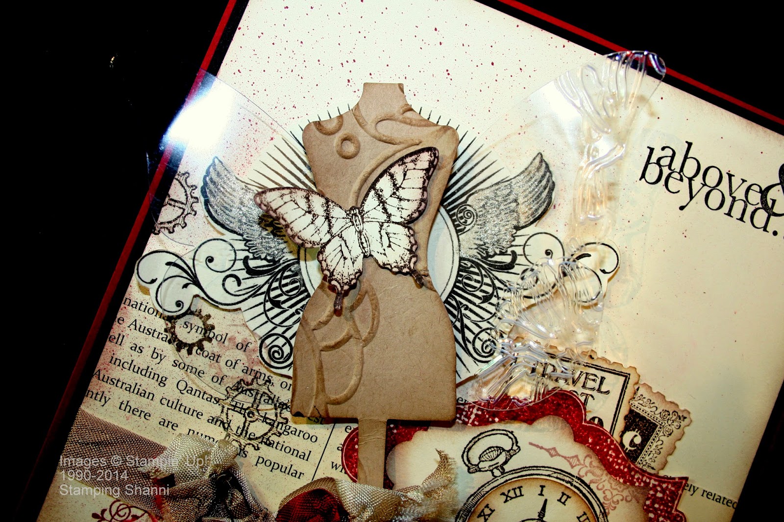
The main feature of the card is the winged bust. Starting from the back and moving forward. The sunray stamp with wings and filigree is from the set Great Sport; I stamped this stamp in Staz On Jet Black ink on Very Vanilla cardstock and fussy cut around the image. I brushed Illuminate Glimmer Watermark ink on the wings to pop them a little. I then cut Window Sheets using the Beautiful Butterflies Bigz Die and embossed the edge of the right wing using the Flower Garden TIEF.

I love the Dress Form Pop 'n Cuts die and cut just the bodice using Crumb Cake cardstock. I then embossed the piece using the Elegant Lines TIEF (although in the real swap I used Flower Garden TIEF again as Elegant Lines had retired). I daubed the edges and raised sections on the bodice with Crumb Cake ink. Finally I stamped the butterfly from Papillon Potpourri in Staz On Jet Black Ink, punched it with the Elegant Butterfly Punch and daubed it lightly on the edges with Crumb Cake ink. I attached it with Glue Dots.
You can see from another angle how many layers there are and how each level adds a different dimension. I know that I added a heap more steps to the final card which ended up including wheels and additional stamp sets although the overall effect was similar to this prototype. 

A final shot of the card standing up as it would on a desk or shelf:
I enjoyed making the swap and would happily have made 100 in order to have collected that same number from all the other talented attendees.  

Thursday, May 1, 2014

Soho and Backyard Basics

I adore the antique filigree of the Crisp Cantaloupe page of the Soho Subway DSP - in fact you have probably worked out that I adore the entire range of Soho Subway DSP. . .
I wanted to use it in full size to show it off to its full extent. So part of my thoughts behind embellishing the background was with this in mind - show, don't cover. Using the new Scallope Edge Tag Topper I punched a piece of Blushing Bride cardstock top and bottom and stamped it in Early Espresso using the En Francais background stamp. I then cut out a piece of Window Sheet (acetate) with the Apothecary Accents Framelit Dies and embossed it with the Beautifully Baroque TIEF, mounting it on top of the script.
I wanted a stamped image which complemented but did not compete with the background design so I stamped and masked the flowers from Backyard Basics in Jet Black Staz On ink and coloured them with Crisp Cantaloupe, Blushing Bride and Pear Pizzazz ink and an Aqua Painter. I then fussy cut around the flowers and mounted them on top of the Window Sheet cut out.

The ribbon embellishment is Very Vanilla Seam Binding tied off with the Gold Bakers Twine. The sentiment is from Chalk Talk, I have punched it out using the Extra Large Oval Punch and I have mounted this on a piece of Early Espresso which I cut with the Ovals Framelit Dies. The little Basic Pearl Jewels set the sentiment off well.
The butterfly is from the Best of Butterflies set, stamped in Jet Black Staz On ink and painted with Blushing Bride ink and Aqua Painter.

Hope you love this paper as much as I do.
Shanni